The map of the world hanging in your childhood classroom was wrong. The one on your phone is wrong. Every world map you have ever looked at is wrong — and this isn't a matter of opinion or outdated information. It is a mathematical certainty. You cannot accurately represent a sphere on a flat surface. It is physically impossible. Something always gets sacrificed.
The question isn't whether your map is lying to you. It's what lie it chose — and why. Because the specific distortions each map makes aren't random. They reflect the priorities, politics, and worldview of whoever made them. And once you see it, you can't unsee it.
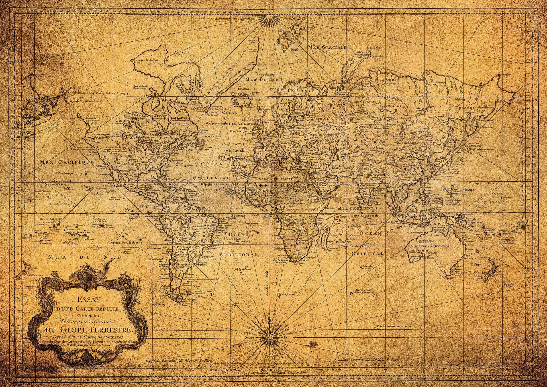
The map most of us grew up with is called the Mercator projection, created by Flemish cartographer Gerardus Mercator in 1569. It was designed for one specific purpose: helping sailors navigate straight-line routes across the ocean. For that, it's excellent. For accurately representing the size of continents relative to each other, it is a disaster.
The Mercator projection inflates land masses as they get further from the equator. The result is staggering. Greenland appears roughly the same size as Africa on a Mercator map. In reality, Africa is 14 times larger. Europe looks comparable to South America. It is less than half the size. Alaska appears bigger than Brazil. Brazil is nearly five times larger.
This matters beyond trivia. For centuries, the Mercator projection was the standard map used in schools, governments, and newsrooms across the Western world. Generations of people developed their entire mental model of global geography — and by extension, global importance — from a map that made Europe and North America look dominant and Africa and South America look small. That wasn't an accident of math. That was a choice.
Other maps made other choices. The Peters projection, introduced in 1973, preserves accurate land area — meaning Africa and South America appear at their true, enormous scale. It was immediately controversial. European and American cartographers attacked it fiercely, and it's not hard to understand why: it made the Western world look significantly smaller than people were used to.
Then there's the question of which direction is "up." North-up maps are so universal that they feel like a fact of nature. They aren't. There is no up or down in space. South-up maps exist and are perfectly valid — they simply look disorienting to anyone raised on the convention that north belongs at the top. That convention was established by European cartographers, at a time when Europe considered itself the center of the world.
Even the centering of maps is a choice. Most Western maps place Europe and the Americas at the center, splitting the Pacific Ocean in half. Maps made in Australia or China center the world differently — and suddenly familiar continents appear in unfamiliar positions, revealing just how much of what we think of as geographic "fact" is really just perspective. Every map is someone's argument about what matters. You just weren't told that when you were staring at the one on the classroom wall.